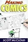
Writing with pictures.
Choice of:
- Moment.
Expands on choice of moments that matter
and the resulting six types of transition between panels first presented in
Blood in the gutter
in
Understanding Comics: The Invisible Art.
- Frame (distance, angle, where to trim). Show what the reader needs to see for place and focus.
- Image. Quick and clear evocation of characters, objects, environment, symbols.
- Words. Clear and persuasive communication in seamless combination with images.
- Flow. Transparent and intuitive reading experience.
The center of the frame shows what is important:
a person,
the motion of an object,
the absence of someone,
a distance to be crossed or already crossed,
or someone directing attention to something not yet seen.
The contrast and balance of clarity versus intensity.
The many exercises at the end include the great loosening-up exercises
of "Quanto comics" and "24-hour comics".
Stories for humans.
Character design (with an inner life,
visual distinction,
and expressive traits),
facial expressions, and body language.
For facial expressions
(together with head position, gaze direction, etc.)
consider the six basic emotions and their McCloud's
suggestion of what is indicated by their combinations:
|
| Anger
| Disgust
| Fear
| Joy
| Sadness
| Surprise
|
| Anger
| Rage
| --
| --
| --
| --
| --
|
| Disgust
| Outrage
| Revulsion
| --
| --
| --
| --
|
| Fear
| Caged animal
| Horror
| Terror
| --
| --
| --
|
| Joy
| Cruelty
| 'eeww!'
| Desperation
| Laughter
| --
| --
|
| Sadness
| Betrayal
| Empathy of pain
| Devastation
| Faint hope
| Grief
| --
|
| Surprise
| 'What the --?'
| 'You ate it?'
| Spooked
| Amazement
| Disappointment
| Shock
|
Even more emotions are created by mixtures of intensities as well as which emotions, such as:
- Puzzlement as 'mild disgust' plus 'mild sadness'.
- Pity as 'mild joy' plus 'mild sadness'.
- 'Remembering a deceased loved one' as 'strong sadness' plus 'moderate anger' plus 'moderate joy'.
For body language,
express emotions and relationships through elevation, distance, and imbalance.
Exercises include expressions, body language, targeting expressions, targeting poses, and body language in sequence.
 Disclaimer.
 Links.
 Archive of books read.
 Best books read.
 The Mental Health of George W. Bush
 New books read.
 Booker Prizes.

