PETER & DONNA THOMAS
![]() 260 Fifteenth Avenue Santa Cruz CA 95062 (831)
515-2757
260 Fifteenth Avenue Santa Cruz CA 95062 (831)
515-2757
peteranddonna@cruzio.com
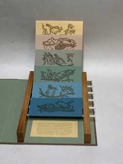
A169. The Paradox of Contradiction. Compiled by Peter and Donna Thomas. Santa Cruz, California, Peter and Donna Thomas (2025). 11 x 8.25 x 1.875 inches. 6 flap pages. (Descending in size from 7.5 – 2.75 x 6 inches). Slipcase: 12.5 x 8.75 x 2.75 inches. 30 copies. $1,475.00
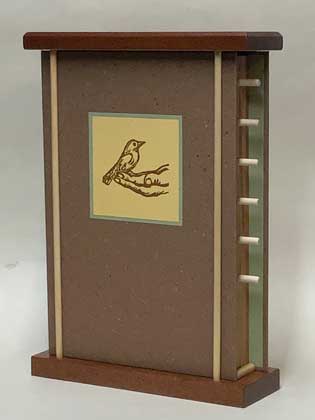
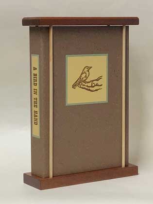
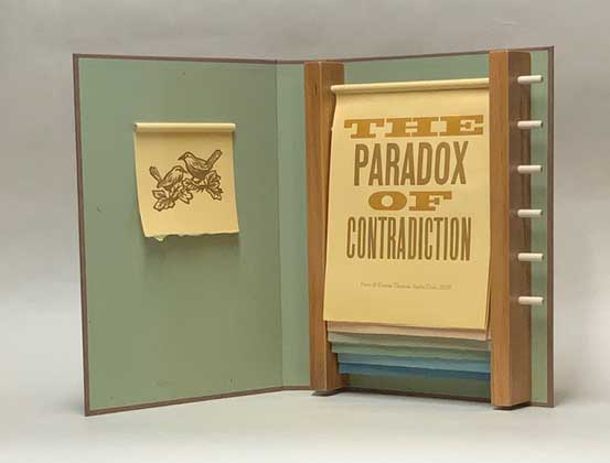
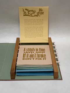
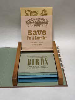
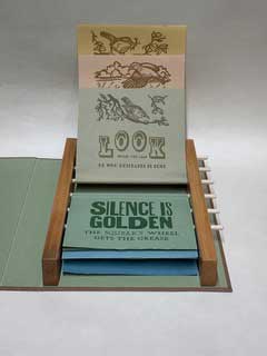
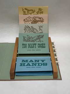
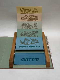
Binding: A "flap" book; case-bound in brown paper, handmade by Peter, over boards. Multilayered label with text on spine. Multilayered label with linocut on front cover. Inside cover paper is green, handmade by Peter. There is a linoleum-cut print of two birds wrapped around a wooden dowel and attached to the front inside cover. The text pages are attached to six rotating wooden dowels, set in a frame made of alder wood and attached to the back inside cover. Paper: Six colors, handmade by Peter. Printing: Letterpress printed on a Vandercook Press. Typography: Hand-set with various wood and metal typefaces. Illustrations: Six linoleum cuts of birds by Donna. Notes: The binding structure was based on previous miniature books we made using the same concept. This book also has a wooden structure that acts as both a slipcase and bookstand. Its base and top are made from blocks of mahogany wood that are connected by wooden dowels. The text of the book is a series of paired adages that contradict each other, which are paired with illustrations of songbirds enjoying those contradictions.
An artists' statement follows images
...Frustrated by fake vs real news, and political factions manipulating facts to fit their agenda while refusing to seek common ground, I was inspired to use conflicting adages for my text, to provide hope, for they show that there are always more than two sides to a coin, and always ways to find a shared truth thru studying contradictions...
Artists' statement:
Adages, proverbs, sayings, maxims, fables, and quotes: these short sayings have always intrigued us; they advise us, guide us, and confuse us. As book artists Donna and I have used these as text in many of our books. Some time ago we realized that as artists we had no call to present lengthy texts, but we still liked using well written and respected literature, so often just printed a sentence or paragraph from a larger work. It was a mutually beneficial act: we shared great literature with our audience, and the author was exposed to new readers. Most of our early books had traditional codex bindings, but in the 1990s we began creating alternative binding structures. The first were scrolling texts that housed codex bindings. Their scroll-pages, supported by dowels, led to the idea of making 'flap-books' with flap-pages hung over dowels, which when rotated exposed the back side of the 'page'. We found these books created an opportunity to explore two contrasting ideas or pair translations. In our 1997 book '40' the front text was in Latin, the back in English. In our 2003 book 'Time I$', Ben Franklin's quote: "Time is money" was printed on the front flaps, on the back flaps was Mark Twain's parody, "Geological time is not money." This idea of pairings overflowed into my musical life. In 2013 I wrote a song paring conflicting adages, with a chorus that asked, "What is the truth, please tell me..."
In October 2024, I went to Denver to lead a collaborative workshop at Ray Tomasso's InterOcean Studio. Ray and I had shared the adventure of learning to make paper and discovering its history. When Ray passed away, his wife Dianne opened his studio for community members to use. This workshop, creating a book using his equipment and handmade paper art, provided an opportunity for me to celebrate my past with Ray and say adieu. Ray had been a zealous collector of everything paper and print related. His shop had a reference library, paper mill, and a letterpress printing studio with a vast collection of wood type. To catalog that type, Ray had printed a 4x6 specimen card for each typeface. As I lined those cards out to decide which I would use, an idea for a future project flashed through my mind. It would be something like the 'commonplace books' popular with private press printers in the 1950-70s (like Santa Cruz's Sherwood Grover), but it would be an artist's book with a flap-book structure.
On returning home, shortly after the November 2024 election, I start working on the book. Frustrated by fake vs real news, and political factions manipulating facts to fit their agenda while refusing to seek common ground, I was inspired to use conflicting adages for my text, to provide hope, for they show that there are always more than two sides to a coin, always ways to find a shared truth thru studying contradictions. It seemed logical that the flap-pages would present one of the pair on the front, the other on the back, to be revealed when the flap was rotated. I spent most of November and December playing with type, choosing which adages to use and exploring different combinations of type, trying to find resolution. At the same time, we started thinking about the binding structure, making a series of mock-ups, varying the dowels spacing, and the flaps' distance from the foot of the book, until we found a pleasing combination. We decided to have multi-colored pages and made the paper from white rag, colored with pigments, in a sympathetic gradient of six different colors.
Now we had our materials and structure. It was time to develop the book/work into a final form. I have always said that a great artists' book, what I have called the "Mona Lisa of the Book", will have a strong aesthetic concept, and be made using appropriate materials, lush and rich or stark and plain, to undergird the concept. In my mind, this book will combine great literature and illustrations, and be placed on the pages in a way that best supports the concept. Its binding will further reinforce the aesthetic theme, yet also be strong enough to stand on its own, in a glass case, as an artwork. With this in mind we turned our attention the books contents. I was deliberating on a title the day we had a visit from our endlessly creative friend, Mark Kapner. I showed him what we were working on and he immediately suggested titles like "Flip/flop Flip/flap" and "Two Sides of the Same Coin". The next morning I received an email from him: "As much as I love what I suggested yesterday, I couldn't resist asking ChatGPT to come up with some titles and here are some of the suggestions: Flipsides: Wisdom in Paradox, Echoes and Opposites, Counterpoints: A Book of Contradictions, Reflections in Reverse, Contradictions Unfurled..." This helped Donna and I come up with a provisional title for the book: The Paradox of Contradiction, but left us wondering about the ethics of using AI's advice to create an art work made by hand. A few days after that I ran into Chris Connery, a professor at the University of California Santa Cruz. I described our project to him and the AI influenced provisional title. He suggested we might benefit by reading Hegel's Science of Logic, which addresses contradiction. We did, but it was like being back in a college philosophy class, reading the same sentences and paragraphs over and over, trying to understand what we had just read. When we found Hegel's premise that contradiction is what drives the universe forward, we found a foothold to rough out an introductory text about the contradicting adages, later to be polished like a gem stone by another UCSC professor, poet Gary Young.
It was at this point we started to consider what to use for the illustrations. Donna wanted to make linoleum cuts that at first glance would appear to be contradictory to what the reader would expect; to create some sort of paradox to be unraveled and resolved upon deeper consideration of the book. It came to her that birds do not give each other advice. They are not capable of being confused by conflicting ideas. They just follow their instincts. Humans, on the other hand, for the most part have lost their willingness to follow intuitions and instincts. If her illustrations were of birds they would represent one way to resolve the paradox of conflicting ideas and advice. When we started making page proofs for this structure, the idea of one adage per page proved too sparse, so we paired the contradictory adages. Mocking up all the pages revealed an aesthetic problem common to commonplace books: a lack of typographic unity from page to page. We then reset everything, limiting the typefaces used, repeating their use where they worked best, until we were satisfied.
Between 2009-2019 we made four cross-country road trips, traveling in our artistic tiny home on wheels, as the Wandering Book Artists. We taught classes and gave talks about the book arts as we visited university and community-based book arts centers around the country. In those talks I often compared an artists' book to a poem, saying "If a poem is successful, if an artists' book is successful, you will finish reading it. And if it is really good, you will go back and read it a second time. And if it is a Mona Lisa, there will still be something new for you discover in that third reading. And if after that you read a critic's review, they will reveal something about the work you had not discovered on your own, for a great poem is deeply layered with nuance. And a Mona Lisa of the Book is like a great poem. It will have immediate appeal, and also layers and layers of complexity to be revealed as it is studied." When we made the cover paper we used a blend of the pulp left over from making the text pages to lend color harmony. A hard bound trial book revealed undiscovered potential, and we broke an expected binding convention, trimming back the foredge of the front cover, allowing the dowels to become a visual element. We added one more layer to the book by lacing a pair of contradicting adages through the structure. Where one would usually expect a title on the spine, we placed a label with the first half of the adage, "A bird in the hand is worth two in the bush." That adage was completed on the verso to the title page, under the illustration attached to the inside of the front cover. The contradicting adage is disguised as the first line of the colophon.
With that, the binding was done, but not complete. It needed some sort of slipcase/clamshell/container. The tongue-in-cheek thought that it should be a birdcage led us to make a slipcase-like birdcage-like structure. There were a few unsatisfactory trials with construction wood before we tried mahogany. The rich brown wood complemented the cover, contrasting nicely with the light-colored dowels. Then came the work: mill the wood, cut it, bevel it, sand and finish it, then drill the holes and assemble it. As the old saying goes...Rome wasn't built in a day, good things take time, and great things take a little longer. From concept to completion, this edition took eleven months. What started out as an intriguing typographic challenge, a way to process conflict, led to an exploration of structure, a study of philosophy, agonizing decision making, and delightful breakthroughs. In the end we had an artists' book, a rich and complex art work, that we think may be our best work yet.